Opinion: How we can use data to prevent cycling deaths in Los Angeles
- Share via
To say Los Angeles’s Vermont Avenue is bad news for bicyclists would be putting it mildly. Over the past five years, cyclists have been involved in 230 collisions with cars along this roadway — more than on any other street in the city.
More than 30 of these accidents occurred in just three intersections: West 4th Street, Olympic Boulevard and Jefferson Boulevard. A heatmap of bike accidents last year shows Vermont covered with collisions between Beverly and Exposition boulevards. So, what exactly is going on here?
(DataScience)
Saving lives with data
Typically, we think of accidents as random, unforeseeable tragedies. But in reality, we can often predict, analyze and address the root causes of these collisions — if we have the right data.
That’s the approach Sweden has taken starting in 1997, when the country’s parliament approved a road safety program called Vision Zero, which aimed to reduce the number of traffic fatalities to “zero” by making data-driven adjustments to infrastructure. The program has proved a great success. Collision fatalities have decreased since the introduction of Vision Zero, even as traffic volume has increased. In Malmö, its biggest cycling city, for instance, there have been only 16 cycling fatalities in a decade, despite the 100,000 trips per day for the city's 307,000 inhabitants.
The program has since spread across Europe to the U.S., and this year to Los Angeles. In August, Mayor Garcetti announced his intention to eliminate all traffic deaths by 2025, an ambitious goal that my company DataScience is proud to support.
Data + visualization = insights
The pioneering data scientist John Tukey said, “The greatest value of a picture is when it forces us to notice what we never expected to see.”
We often hear that Los Angeles is a dangerous place for cyclists. It simply is a byproduct of living in a city ruled by cars. When we look at the data, it becomes apparent that, yes, L.A. is a dangerous place for cyclists. But those dangers aren't an inherent product of our culture, necessarily.
The California Highway Patrol has fantastic data on collisions, and after geocoding the data, a series of patterns begin to emerge. The interactive maps below show just an iceberg’s tip of the insights the collision data hold for us.
First, we can look at the 10 worst locations for bicycle collisions to identify specific intersections that are of interest.
(DataScience)
Next, we can look at the more than 80 worst locations for collisions. That’s where we’ll start to see patterns, including the abundance of bicycle accidents on Vermont Avenue, Figueroa Street and elsewhere.
(DataScience)
Finally, we see the most detail in this heat map of collisions from the past 12 months. You can zoom around and search by specific address to see where collisions have occurred in any region of any size. For example, zooming in on the red splotches in Venice show us the density of collisions surrounding Lincoln Boulevard.
(DataScience)
From data exploration to solutions
The maps above feature a single factor: collisions. Meanwhile, the available data sets include more than 30 features for each collision, including times, who is at fault (biker or driver), severity of injuries and more. The first step in any data exploration is prioritization, and the maps alone provide an excellent starting place.
Our data not only tell us to watch out for Vermont Avenue, but, as we see from the graphs below, it can help show us what the problems on this roadway really are. Drivers involved in the 230 collisions were routinely at fault for failing to yield the right of way, improperly turning and driving at unsafe speeds. When bicyclists were at fault, the overwhelming reason was that they were riding on the wrong side of the road.

(DataScience)
Now that we’ve identified where the problem is and the primary causes, we can identify solutions to ensure that drivers yield to bicyclists and bicyclists stay on the right side of the road.
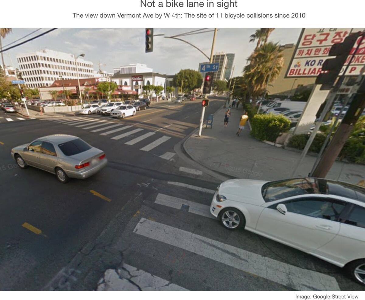
Sweden and the Netherlands are examples of bicycle safety success, and they’ve found engineering separations between cars and bicycles to be key. New York has similarly reduced bicycle collisions through the use of parked cars as separators. Just by looking at the bleak bicycling picture at Vermont and 4th, where 11 bicycle collisions have occurred since 2010, we can see that a painted bike lane alone would be a good start.

(DataScience)
There may be other solutions. Take a look at the maps and let us know where you think the problem areas might be, what patterns you see, and where you’d like us to take a deeper dive into the data.
Los Angeles is a world leader in open data. Angelenos can take advantage of this information to ask their city leaders for important, evidence-based changes to make our city a safer place. This small example shows how our data, with visualization and analysis, can be transformed into life-saving insights.
Dave Goodsmith is a data scientist at DataScience, Inc.. You can find him on the DataScience blog and @thegoodsmith.
Follow the Opinion section on Twitter @latimesopinion and Facebook
Related: Times analysis finds the county's 817 most dangerous intersections
A cure for the common opinion
Get thought-provoking perspectives with our weekly newsletter.
You may occasionally receive promotional content from the Los Angeles Times.


